
Canvas Redesign
This was an 8 week, comprehensive project that looked at the current (LMS) Learning Management System for the University of Washington. The system is called Canvas, and although it hasn't been around very long, there are lot of issue and complaints, both by students and professors. This investigation into a re-design for Canvas started with research as a guiding direction to inform by decisions. Throughout the process, I would test ideas with users, both gorilla testing and semi-structured interviews to make sure the re-design direction was appropriate and useful. The overall process and final design can be seen below.
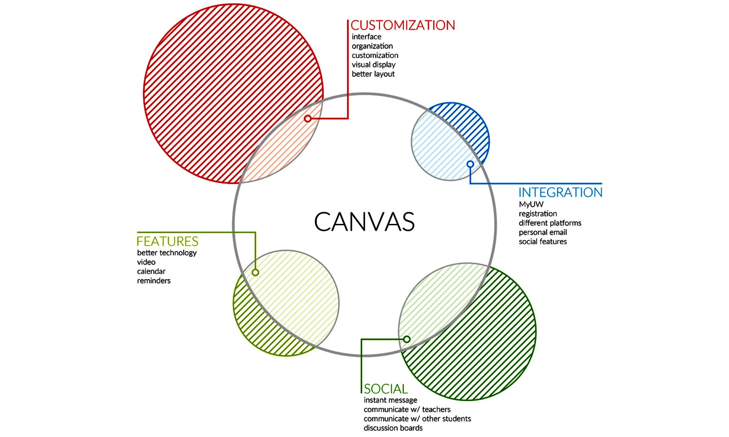
Research.
I heard this over and over again: Canvas is just okay. It seems to work in some capacity for all of the users I spoke with, however, every single person had suggestions for change. So, this is what I saw as the problem: Canvas provides its users (students and professors) a moderate framework as an online learning management system, however, it’s too rigid of a tool and lacks major functionality that would benefit the entire user population. After conducting several interviews and reviewing survey data, there were several high level problems, but the one I heard the most and began my initial focus on is customization. Canvas as we know it is just too rigid of a system and what you see is what you get.
Students that use Canvas are frustrated. They can’t manipulate the system (customize it) to have it perform for their individual needs. They are looking for a platform that each one can control what they see, how they see it, and when it shows up. Instead, they’re stuck using a system that works okay for everyone, and great for no one. Canvas [Re]imagined takes a clunky, rigid framework and makes it everything for everyone.

Ideation.
One thing I heard over and over was how people are unhappy with the way Canvas looks. Understanding that everyone will have a different opinion of what Canvas should look like, I wanted to use the ideation as a way to surface several different ideas that could represent the users desire for a more graphical interface. My idea of any of the sketches would be that user would have the ability to update or change where content goes, as they feel fit, I'd just be supplying the out-of-the-box framework.


Wireframe/testing.
Before jumping into wireframes, I did a heuristic analysis of the existing Canvas site. I wanted to benchmark the current sites problems just before developing the new wireframes so I would have a clear understanding of what wasn't working. Overall, the current site is a mess and every single page has issues that the new site tries to eliminate. The three that were most critical from Nielsen's "10 Usability Heuristics for User Interface Design” were user control and freedom, consistency and standards, and match between system and the real world. Once I was able to document these issues, I went back to designing, starting with a User Flow Diagram of the new system.
The User Flow diagram below represents someone logging into Canvas and then navigating to their calendar. Once they are at the calendar view, they create a new event for their class, which notifies them via email and sends a notification to their individual class page. The areas in gray represent other options, but are not related in this particular scenario.
Once the wireframes were created, I wanted to evaluate if the participants performed certain tasks like I thought they would. Did they understand where to click in order to check their email or view the calendar? Did they follow the layout as I expected them to? Did they find it easy to use than the existing Canvas site? Overall, I wanted to see how comfortable with the new layout they were and if they could understand the shortcuts as intuitive, or was this creating a new pain point?

Design.
I used the feedback from the wireframe testing to drive the updated design below. This design is sleek and clean, similar to the initial idea, but with the functionality that users can appreciate. The homepage provides lots of high level details such as an email overview showing how many new messages you’ve received, updates from your classes (notifying you about grades, assignments, discussions) and a calendar overview. It’s a prompt to tell the user that something is there. It’s really up to the user to seek out the information, or ignore it until they need to know about it.
Overall, the high level of customization by the user is key. The ability to make Canvas what you, the user, really wants was something that the current platform is missing. It’s also image-focused, modern, easy to navigate and provides just the right amount of information on each page.

